0
A
回答
4
Here is jsfiddle的解決方案。它基於SVG radial gradients。
對於每個節點,梯度定義爲:
var grads = svg.append("defs").selectAll("radialGradient")
    .data(nodes)
    .enter()
    .append("radialGradient")
    .attr("gradientUnits", "objectBoundingBox")
    .attr("cx", 0)
    .attr("cy", 0)
    .attr("r", "100%")
    .attr("id", function(d, i) { return "grad" + i; });

grads.append("stop")
    .attr("offset", "0%")
    .style("stop-color", "white");

grads.append("stop")
    .attr("offset", "100%")
    .style("stop-color", function(d) { return color(d.cluster); });
然後,代替行:
:.style("fill", function(d) { return color(d.cluster); })
此線在創建圓的代碼添加
.attr("fill", function(d, i) {
    return "url(#grad" + i + ")";
})
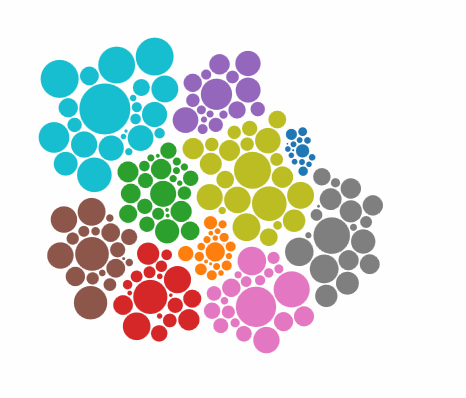
這產生這個eff ECT:(動畫GIF,我使用的具有用於顏色數量一定的侷限性,所以梯度不光滑如在真實的例子)
2
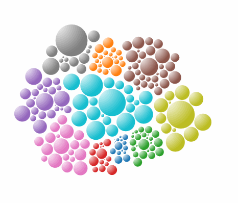
創建線性或基於使用不同的顏色您的要求徑向漸變。將填充屬性設置爲漸變。
var gradient = svg.append("svg:defs")
    .append("svg:linearGradient")
    .attr("id", "gradient")
    .attr("x1", "0%")
    .attr("y1", "0%")
    .attr("x2", "100%")
    .attr("y2", "100%")
    .attr("spreadMethod", "pad");

gradient.append("svg:stop")
    .attr("offset", "0%")
    .attr("stop-color", "#0c0")
    .attr("stop-opacity", 1);

gradient.append("svg:stop")
    .attr("offset", "100%")
    .attr("stop-color", "#c00")
    .attr("stop-opacity", 1);

var node = svg.selectAll("circle")
    .data(nodes)
    .enter().append("circle")
    .style("fill", "url(#gradient)")
    .call(force.drag);
相關問題
- 1. D3節點佈局的節點大小
- 2. D3徑向力佈局
- 3. 如何在d3力佈局中實現雙向平行邊緣?
- 4. D3js力佈局 - 與節點
- 5. d3力佈局排斥力公式
- 6. D3樹佈局 - 力子節點使用的可用空間
- 7. 計算d3力佈局節點座標的平均值
- 8. D3力佈局:鏈路和節點--- z-index的
- 9. Android佈局:如何實現這個特定的外觀?
- 10. D3力佈局節點總是在開始屏幕
- 11. 重繪d3力佈局而不移動節點
- 12. 固定節點位置在D3力導向佈局
- 13. 調整D3力佈局
- 14. D3.js力佈局拖/縮放/平移和連接節點的能力
- 15. 無限放大力佈局d3.js
- 16. 如何實現defaultLayout以外的佈局
- 17. D3 Force佈局圖 - 自連接節點
- 18. d3強制佈局 - 定位節點
- 19. d3js創建固定節點力佈局
- 20. d3 v4具有邊界的力佈局
- 21. D3力佈局與幾何船體
- 22. d3.js力佈局增加linkDistance
- 23. D3節點位於網格中的節點佈局圖
- 24. D3力導向佈局:邊框
- 25. 如何刪除樹形佈局D3.js上的節點?
- 26. 如何刪除D3強制佈局中的節點?
- 27. 如何使用D3強制佈局與現有的SVG元素作爲節點
- 28. 實現平移,同時保持節點在d3強制佈局中可拖動
- 29. d3-js的力定向佈局是否支持圖像作爲節點?
- 30. D3力可摺疊佈局 - 啓動頁面的所有節點崩潰