5
我正在創建一個網站,它將使用我無法平鋪的圖像。我需要這張圖片來覆蓋整個背景屏幕。但是,我希望這可以在較大的顯示器以及較小的顯示器上工作。大背景圖像和屏幕尺寸
我應該使用一個大的背景圖像並使用background-size將其縮小或者我應該創建多個版本的不同尺寸的相同圖像,然後使用CSS3 Media Queries來選擇要顯示的圖像?如果是的話,我應該使用屏幕尺寸的哪個斷點?
我正在創建一個網站,它將使用我無法平鋪的圖像。我需要這張圖片來覆蓋整個背景屏幕。但是,我希望這可以在較大的顯示器以及較小的顯示器上工作。大背景圖像和屏幕尺寸
我應該使用一個大的背景圖像並使用background-size將其縮小或者我應該創建多個版本的不同尺寸的相同圖像,然後使用CSS3 Media Queries來選擇要顯示的圖像?如果是的話,我應該使用屏幕尺寸的哪個斷點?
我最終選擇了基於信息從StatCounter的5個斷點:
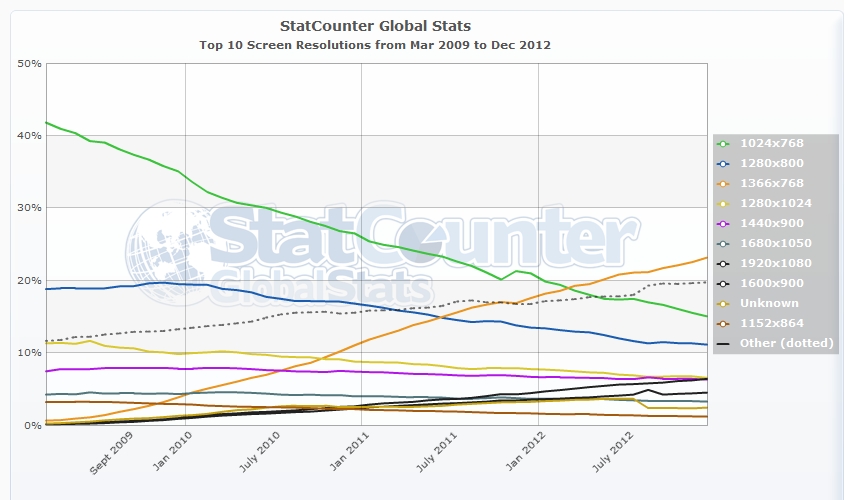
這是截至2012年12月
基於關閉這些號碼,我的測試,並說給別人我選擇了以下選項:
/*Monitors Large than 1920px, image has "soft" edges to blend into background */
@media (min-width:1921px){
    html, body{
background: url(/images/backgrounds/1920-bg-large.jpg) no-repeat center top fixed #190303;
background-size:100% auto;
    }
}

/* Mointores ranging from 1367px - 1920px */
@media (min-width:1367px) and (max-width:1920px){
html, body{
background: url(/images/backgrounds/1920-bg.jpg) no-repeat center top fixed #190303;
background-size:100% auto;
    }
}

/* Mointores ranging from 769px - 1366px */
@media (min-width:769px) and (max-width:1366px){
html, body{
background: url(/images/backgrounds/1366-bg.jpg) no-repeat center top fixed #190303;
background-size:100% auto;
    }
}
/* Tablets like the iPad 2 and iPad Mini */
@media (max-width:768px){
html, body{
background: url(/images/backgrounds/768-bg.jpg) no-repeat center top fixed #190303;
background-size:100% auto;
    }
}

/* At a certain point the Background images become irrelevant as they are hidden behind other elements. Changed to a solid BG */
@media handheld, only screen and (max-width: 640px) {
html, body{
background:#190303;
    }
}
body
{
background-image:url('smiley.gif');
background-repeat:no-repeat;
background-size:100% 100%;
}
這應該在每個屏幕的每個瀏覽器中展開它。
我只是在所有人身上使用大號。
您可以使用background-size屬性設置爲contain或cover。這對於照片背景(相對於圖案)而言效果特別好,其中縮放僞影不明顯。
記住有關設置後退規則爲IE8和下(只是一個拉伸的背景就足夠了)。
我建議使用這兩種方法。準備兩張圖像(比如寬度= 500px和寬度= 1500px),如果屏幕寬度低於750,則使用500px,因爲它可能是一個內存較小且帶寬有限的平板電腦,否則使用1500px。也讓它們適合css的屏幕。 – benbai123