0
我的頁面上有一些div從菜單中選擇時從上方下拉。這按預期工作。但是,當元素位於其最終位置並且視口已縮小到移動友好視圖時,激活下拉菜單會導致元素首先跟隨菜單的向下移動(正常和正常),但在菜單動畫完成後元素捕捉到不同的位置。一個很酷的效果,如果有意的,但不是我想要的東西。 (從菜單第一選擇後)的影響可以在這裏看到:CSS阻止元素在轉換緩和後跳入到位
我使用未經編輯bootstrap.css 3.3.6與本fiddle
按下發現移動圖標,自定義CSS小提琴編輯器在小屏幕窗口中打開它。
重現:運行小提琴,從菜單中打開任何項目,確保存在漢堡包菜單,在內容可見時打開和關閉菜單。
這裏是CSS如果你不想或者不能查看小提琴:
html {
    font-size: 14px;
}

body {
    font-family: "Helvetica Neue", Helvetica, Arial, sans-serif;
    background-color: black;
}

.navbar {
    background-color: transparent;
    background: transparent;
    border: 0;
}

.navbar li {
    color: slategrey;
    font-size: 14px;
}

.navbar-collapse#myNavbar {
    -webkit-box-shadow: none;
    box-shadow: none;
}

.collapsing {
    -webkit-box-shadow: none;
    box-shadow: none;
    border: none;
}

.collapse {
    border: 0;
}

.navbar .dropdown-menu::after{
    border:0;
}

.navbar-header .navbar-collapse {
    border: 0;
}

.navbar.navbar-default {
    padding: 10px 0;
    background: rgba(0, 0, 0, .1);
    border: none;
}
.navbar.navbar-default .navbar-nav > li > a,
.navbar.navbar-default .navbar-brand {
    color: slategrey;
}
.navbar.navbar-default .navbar-collapse {
    border: none;
    box-shadow: none;
}

#name {
    color: white;
}

#center {
    width: 150px;
    height: 150px;
    position: absolute;
    top: 0;
    bottom: 0;
    left: 0;
    right: 0;
    margin: auto;
}

#kyrrContainer {
    width: 100px;
    height: 100px;
    position: relative;
}

#overlay {
    width: 100%;
    height: 100%;
    position: absolute;
    z-index: 10;
}

.panel {
    min-width: 80%;
    height: 75%;
    margin-left: 10%;
    margin-right: 10%;
    overflow-y: auto;
    overflow-x: hidden;
    margin-top: -300%;
    position: absolute;
    background: #000;
    box-shadow: 0px 4px 7px rgba(0,0,0,0.6);
    z-index: 11;
    -webkit-transition: all .8s ease-in-out;
    -moz-transition: all .8s ease-in-out;
    -o-transition: all .8s ease-in-out;
    transition: all .8s ease-in-out;
    /*animation-name: colorTransition;
    animation-duration: 5s;
    animation-timing-function: ease-in;
    animation-delay: 1s;
    animation-iteration-count: infinite;
    animation-direction: alternate;*/
}

.panel:target {
    margin-top: 0%;
    background-color: #ffcb00;
}

.transitionedText p {
     font-size: 18px;
     padding: 10px;
     line-height: 24px;
     color: #fff;
     display: inline-block;
     background: black;
     margin: 10px 0px 0px 10px;
    }

    .transitionedText li {
     list-style-type: hiragana;
    }

    .content h2 {
     font-size: 110px;
     padding: 10px 0px 20px 0px;
     margin-top: 52px;
     color: #fff;
     color: rgba(255,255,255,0.9);
     text-shadow: 0px 1px 1px rgba(0,0,0,0.3);
    }
和HTML:
<nav class="navbar navbar-inverse">
<div class="container-fluid">
<div class="navbar-header">
<button type="button" class="navbar-toggle" data-toggle="collapse" data-target="#myNavbar">
<span class="icon-bar"></span>
<span class="icon-bar"></span>
<span class="icon-bar"></span>
</button>
</div>
<div class="collapse navbar-collapse" id="myNavbar">
<a class="navbar-brand" href="#home"><div id="kyrrContainer"><div id="overlay"><p id="name">K B</p></div></div></a>
<ul class="nav navbar-nav navbar-right pull-right">
<li><a href="#music"><span class="glyphicon glyphicon-music"></span> Music</a></li>
<li><a href="#web"><span class="glyphicon glyphicon-tasks"></span> Web</a></li>
</ul>
</div>
</div>
</nav>
<div id="center">
<div id="home" class="content">
<div id="kyrrContainer">
<div id="overlay"><p id="name">M Y <br> C O O L <br> P A G E</p></div>
<div id="slow"></div>
<div id="fast"></div>
</div>
</div>
</div>
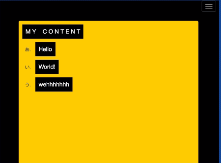
<div id="music" class="panel">
<div class="content transitionedText">
<p>M Y C O N T E N T</p>
<ul>
<li><p>Hello</p></li>
<li><p>World!</p></li>
<li><p>wehhhhhhh</p></li>
</ul>
</div>
</div>
<div id="web" class="panel">
<div class="content transitionedText">
<p>P L E A S E L O O K</p>
<ul>
<li><a href="https://www.example.com/" target="_blank"><p>example.com</p></a></li>
</ul>
</div>
</div>
任何幫助或指針大大appriciated!
無關的問題:你是如何製作gif的? –
Chrome擴展Gif貓@ stig-js – Kyrre
感謝您的信息:) –