0
我正在使用Bootstrap。背景顏色對角線分割響應
我需要實現這樣的結果: 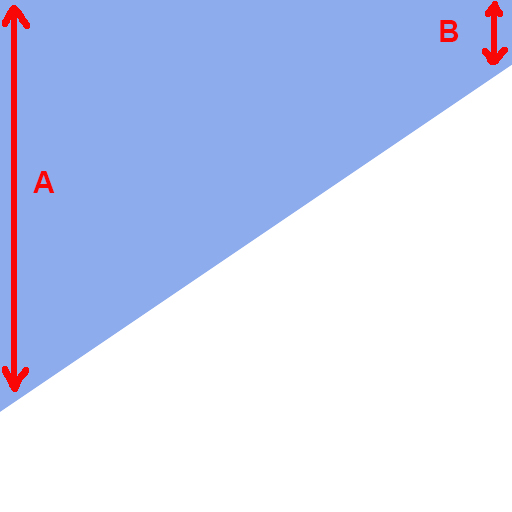
爲此,我開始做這個:
<body>
    <div id="diagonal-bg"></div>
</body>

#diagonal-bg{
    position: absolute;
    left: -800px;
    width: 200%;
    min-height: 700px;
    background-image: -webkit-linear-gradient(118deg, #fff 35%, #8aa8ec 35%);
}
它幾乎因爲只要我調整我在這裏的窗口的工作原理是什麼,我得到: 
如何讓距離A和B在不同尺寸的屏幕/窗口中始終保持相同,以使其響應。
感謝
感謝您的回答@Shube結果是好的,但A和B根據訪問者屏幕不固定。如果我調整我的窗口它改變:( –