3
我試圖在Polymer Starter Kit中混合使用template repeater和the paper-card tutorial。如何使用紙卡創建網格佈局
我的目標是複製那種格: http://cdn.instantshift.com/wp-content/uploads/2014/11/material-design-01.jpg
我創建了兩個自定義元素:
- 員工
- 僱員
員工列表的列表:
<style is="custom-style">
#board {
    @apply(--layout-vertical);   <<= HERE ARE DEFINED THE LAYOUT OF THE GRID
    @apply(--layout-wrap);
    height: 344px;
    width: 384px;
}
#board > paper-card {
    box-sizing: border-box;
    max-width: 184px;
    margin: 4px;
    flex: 0 0 auto;
}
</style>
    <template>
    <div id="board">
     <template is="dom-repeat" items="{{employeesArray}}">
      <employee-element name="{{item.title}}"
          preview="{{item.preview}}"
          width={{item.width}} height={{item.height}}>
      </employee-element>
     </template>
    </div>
    </template>
員工:
<paper-card
    heading="{{name}}"
    image="{{preview}}"
    style="max-width:{{width}}px;
     max-height:{{height}}px;"
    >
    <div class="card-actions">
    <paper-icon-button class="favorite" icon="favorite"></paper-icon-button>
    <paper-icon-button class="bookmark" icon="bookmark"></paper-icon-button>
    <paper-icon-button class="share" icon="social:share"></paper-icon-button>
    </div>
</paper-card>
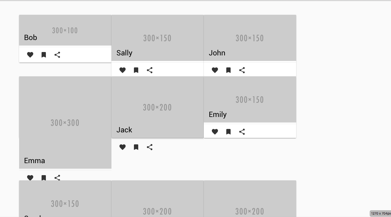
這裏是我得到:

我怎樣才能接近預期的結果?有沒有使卡自動排列的設置?
我怎樣才能得到「回車」般的行爲?
回答結果(感謝@Snekw):
步驟:
添加在您導入元素(元素/ elements.html在我的情況)以下行
<link rel="import" href="../bower_components/iron-flex-layout/iron-flex-layout-classes.html">
我的員工列表元素現在看起來像:
<style is="custom-style" include="iron-flex">
    .flex-wrap {
     @apply(--layout-horizontal);
     @apply(--layout-wrap);
    }
    </style>
    <template>
    <div class="container flex-wrap">
     <template is="dom-repeat" items="{{employeesArray}}">
      <employee-element name="{{item.title}}"
          preview="{{item.preview}}"
          width={{item.width}} height={{item.height}}>
      </employee-element>

     </template>
    </div>
    </template>
我得到這樣的結果:
我還是要修復與紙卡活動面板的問題。