0
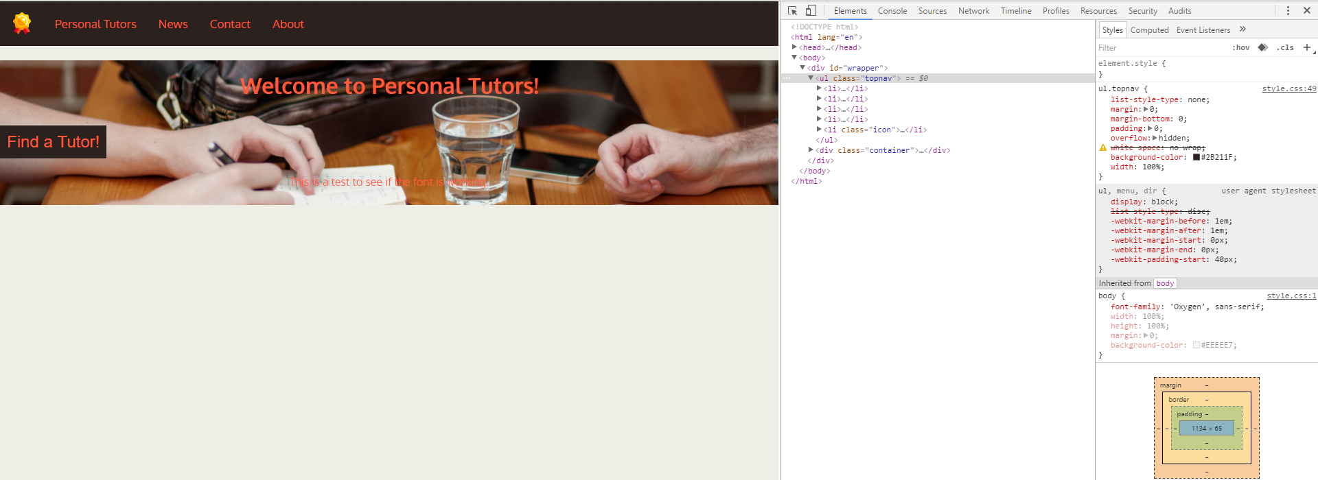
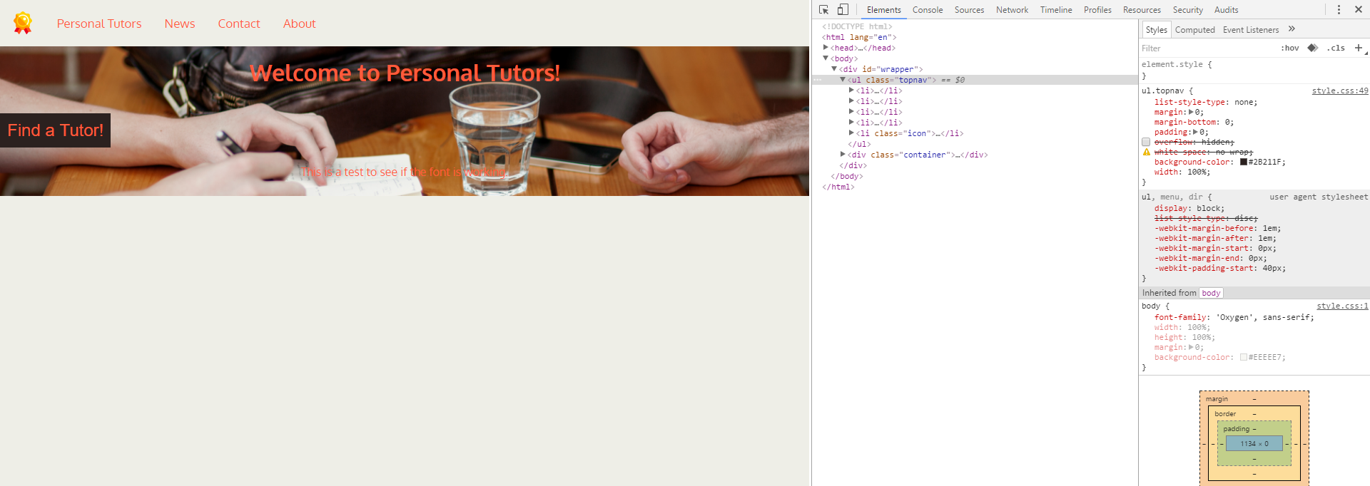
嘗試刪除導航欄下的空白,當您檢查元素並禁用溢出時:隱藏空白消失?導航欄下的空白(溢出)
https://i.gyazo.com/b2f412e61b09f24348a02fd5b7d4bdf3.png>具有溢出 https://i.gyazo.com/cbd9766f50c97a732064133a8a77e25a.png>無
當然它也去掉了背景顏色,所以我想找到另一個修復這個問題?
body {
    font-family: 'Oxygen', sans-serif;
    width: 100%;
    height: 100%;
    margin: 0;
    background-color: #EEEEE7;
}

h1 {
    font-family: 'Oxygen', sans-serif;
}

button {
    color: #FE5B3C;
    background-color: #2B211F;
    border: none;
    padding: 10px;
    text-align: center;
    font-size: 24px;
}

/* The dividers */

#wrapper {
    width: 100%;
    height: 100%;
    padding: 0;
    margin: 0;
}

.container {
    width: 100%;
    height: 100%;
    margin: 0;
    background: url('images/studying.jpg');
    background-size: cover;
    background-position: 0;
    margin-top: 0;
    clear: both;
}

.container h1, p {
    color: #FE5B3C;
    text-align: center;
    padding: .5em;
}

/* Remove margins and padding from the list, and add a black background color */
ul.topnav {
    list-style-type: none;
    margin: 0;
    margin-bottom: 0;
    padding: 0;
    overflow: hidden;
    white-space: no wrap;
    background-color: #2B211F;
    width: 100%;
}

.img-topnav {
    display: block;
    margin: 0;
    padding: 1em;
    height: 32px;
    width: auto;
    max-width: 100%;
    float: left;
}

/* Float the list items side by side */
ul.topnav li {float: left;}

/* Style the links inside the list items */
ul.topnav li a {
    display: inline-block;
    color: #FE5B3C;
    text-align: center;
    padding: 22px 16px;
    text-decoration: none;
    transition: 0.3s;
    font-size: 17px;
    margin: 0;
}

/* Change background color of links on hover */
ul.topnav li a:hover {background-color: #EEEEE7;}

/* Hide the list item that contains the link that should open and close the topnav on small screens */
ul.topnav li.icon {display: none;}

/* When the screen is less than 680 pixels wide, hide all list items, except for the first one ("Home"). Show the list item that contains the link to open and close the topnav (li.icon) */
@media screen and (max-width:680px) {
    ul.topnav li:not(:first-child) {display: none;}
    ul.topnav li.icon {
    float: right;
    display: inline-block;
    }
}

/* The "responsive" class is added to the topnav with JavaScript when the user clicks on the icon. This class makes the topnav look good on small screens */
@media screen and (max-width:680px) {
    ul.topnav.responsive {position: relative;}
    ul.topnav.responsive li.icon {
    position: absolute;
    right: 0;
    top: 0;
    }
    ul.topnav.responsive li {
    float: none;
    display: inline;
    }
    ul.topnav.responsive li a {
    display: block;
    text-align: left;
    }
}
和HTML
<!DOCTYPE html>
<html lang="en">
<head>
<!-- Basic Page Needs -->
<meta charset="utf-8">
<meta name="description" content="">
<meta name="author" content="">
<title>Your Landing Page!</title>
<!-- Mobile Specific Metas -->
<meta name="viewport" content="width=device-width, initial-scale=1">
<!-- FONT -->
<link href='https://fonts.googleapis.com/css?family=Oxygen:400,300,700' rel='stylesheet' type='text/css'>
<!-- CSS -->
<link rel="stylesheet" href="style.css">
<!-- Scripts -->
<script>
function myFunction() {
document.getElementsByClassName("topnav")[0].classList.toggle("responsive");
}
</script>
<!-- Favicon/How to Edit: Make sure the type="" is the right type. Then change the href="" to the path of the image/.ico file you'd like to use. -->
<link rel="icon" type="image/png" href="images/icons/mortarboard.png">
</head>
<body>
<div id="wrapper">
<ul class="topnav">
<li><img src="images/icons/medal.png" class="img-topnav" alt="Home"><a href="#home">Personal Tutors</a></li>
<li><a href="#news">News</a></li>
<li><a href="#contact">Contact</a></li>
<li><a href="#about">About</a></li>
<li class="icon"><a href="javascript:void(0);" onclick="myFunction()">☰</a></li>
</ul>
<div class="container">
<h1>Welcome to Personal Tutors!</h1>
<button>Find a Tutor!</button>
<p> This is a test to see if the font is working. </p>
<div>
</div>
</body>
</html>
順便說一句,你的''