0
目前,我正在嘗試學習移動設備的響應式設計。我遇到的問題是,在增加瀏覽器大小時,我的圖像縮放得很好。但是,他們傾向於超出包含文本的框。我會提供一張照片,以便您可以看到問題所在。圖片移動設備響應設計
如果任何人有任何想法,如何縮放功能,從而真正幫助時要妥善保管內部div的圖像!謝謝!
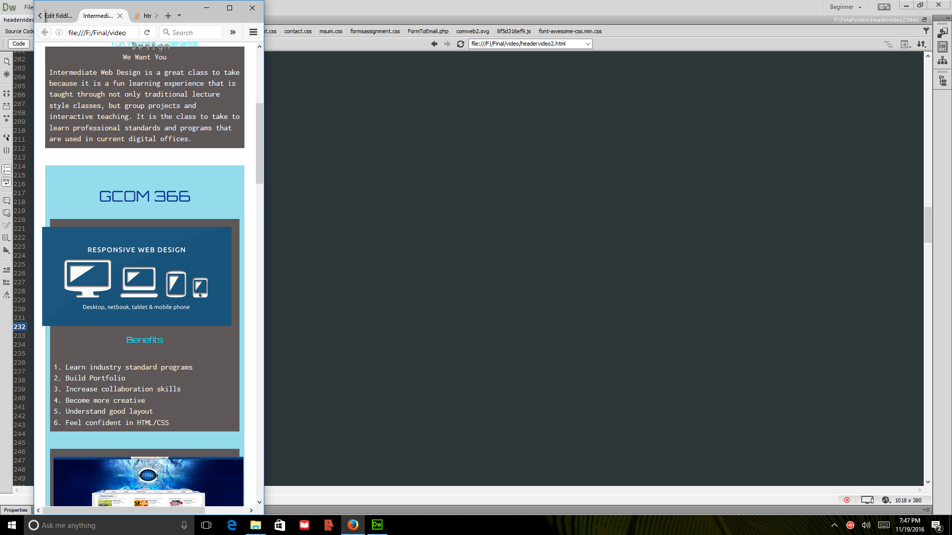
而且,這裏是我的jsfiddle:https://jsfiddle.net/x1mn04p2/(我放在上面的IMG CSS和下方,該網站的CSS的休息,這樣我可以得到充分的樣子)
HTML:
<section>

<div id="box">
<h1> GCOM 366</h1>
<section class="clearfix" id="primary">
<div class="imgbox">
<img class="adjustable" src="weblogo" alt="example web page" width="300" heigh="300" style="float:right">
</div>
<h2> Benefits</h2>

<p class="side">
1. Learn industry standard programs
<br>
2. Build Portfolio
<br>
3. Increase collaboration skills
<br>
4. Become more creative
<br>
5. Understand good layout
<br>
6. Feel confident in HTML/CSS
</p>
</section>


img.adjustable{
width: 100%;
max-width: 400px;
max-height: 400px;
    margin: 1em 1em 1em 2%;
    }