2
我正在尋找將陰影只有應用於表格行之間的線條。在「紅色」線下面的示例中。我不希望陰影適用於藍色邊框。將陰影僅應用於表格行的頂部邊框
如果任何人都可以撥動下面的代碼片段來使它起作用,他們將成爲我今天的英雄。
編輯:我看到我的片段有尖銳的紅線問題。理想情況下,我實際上需要一條堅實的不分紅線。
這是哪門子的效果我在尋找: 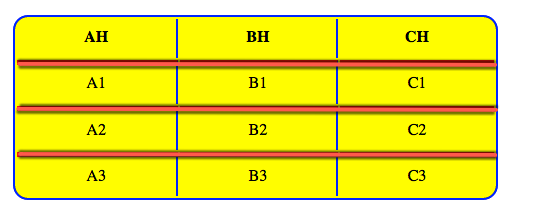
.shadow {

    margin: 20px;

    width: 80%;

    background: yellow;

    border-radius: 15px;

    border: 2px solid blue;

}

.shadow td, .shadow th {

    border-top: 5px solid red;

    border-right: 2px solid blue;

    padding: 10px;

    text-align: center;

}

.shadow th {

    border-top: none;

}

.shadow td:last-child, .shadow th:last-child {

    border-right: none;

}
<div>
<table class="shadow">
<tr>
<th>AH</th>
<th>BH</th>
<th>CH</th>
</tr>
<tr>
<td>A1</td>
<td>B1</td>
<td>C1</td>
</tr>
<tr>
<td>A2</td>
<td>B2</td>
<td>C2</td>
</tr>
<tr>
<td>A3</td>
<td>B3</td>
<td>C3</td>
</tr>
</table>
</div>
不錯,這是從一個角度來看最接近的一個,它的注意事項是1)右上角和左上角都有一個微弱的白色背景。 2)影子只在紅線之下,而不在上面。 3)與其他紅線一樣,陰影不等同於底部讀取線。這在片段運行時並不是很明顯,但是在調整它時(調整'box-shadow:0 3px 4px -1px rgba(0,0,0,0.65);'line)on jsfiddle就是非常明顯的了。 – Trevor
我正在標記你的回答是正確的,即使上面提到的警告我也能達到很好的結果。(我使用的代碼有點短,也許我會張貼它作爲一點)再次感謝 – Trevor
很高興我能夠幫助。 – Brad