0
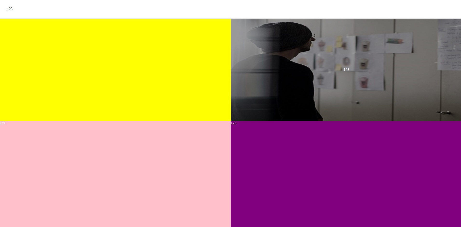
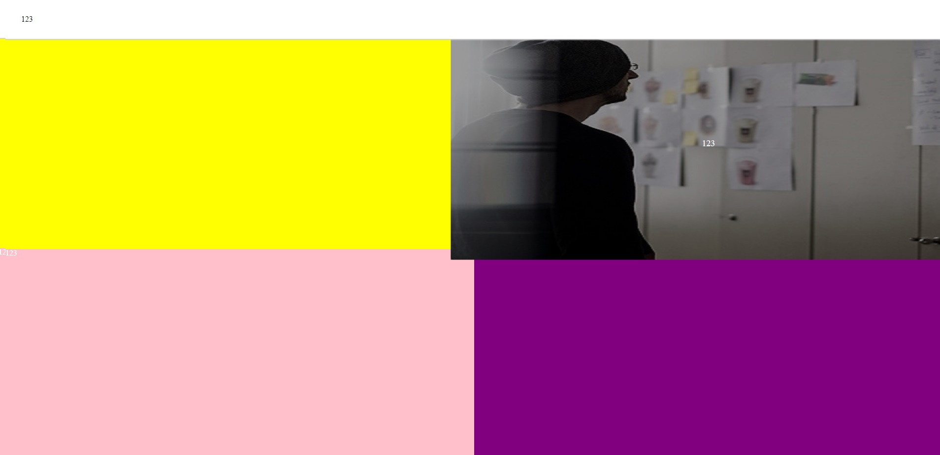
我有一個看起來像this的佈局,我試圖放大懸停時的圖像背景,但我無法以任何方式獲得此效果,而不會影響鄰居元素(懸停時它像this一樣展開) - 我的目標是放大圖像並保留在父div元素內。 Flexbox佈局中是否有任何解決方法?這是我的代碼:在不影響相鄰元素的情況下放大flexbox佈局中的背景圖像
HTML:
<body>
<div class="index-wrapper">
    <nav class="index-menu">
     123
    </nav>
    <main class="index-main">
     <div class="index-square" style="background: yellow;"></div>
     <div class="index-square">
      <div class="index-square-inner" style="background-image: url(assets/img/is-2.jpg); background-position: center; background-size: cover;transition: all .2s ease-in-out;">
       <div style="background: rgba(0, 0, 0, 0.4);">
        123
       </div>
      </div>
     </div>
     <div class="index-square" style="background: pink;">123</div>
     <div class="index-square" style="background: purple;">123</div>
    </main>
</div>
</body>
SCSS:
.index-wrapper {
    display: flex;
    flex-flow: column;
    height: 100vh;

    .index-menu {
    box-shadow: 0 0 2px 2px #d0d0d0;
    z-index: 2;
    background: white;
    color: black;
    padding: 2em;
    }

    .index-main {
    display: flex;
    background: yellow;
    flex-direction: row;
    flex: 1;
    flex-wrap: wrap;

    .index-square {
     flex-basis: 50%;
     display: flex;
     flex-flow: column;

     .index-square-inner {
     flex: 1;
     width: 100%;
     display: flex;
     flex-flow: column;
     justify-content: center;
     align-items: center;

     &:hover {
      transform: scale(1.1);
     }

     div {
      flex: 1;
      width: 100%;
      display: flex;
      justify-content: center;
      align-items: center;
     }
     }
    }
    }
}
將'index-square'的位置設置爲相對和'index-square-inner'爲絕對值,寬度/高度爲100%,頂部/左側位置爲0;應該在不嘗試擴展其父項的情況下獲得縮放。 –
不幸的是,它不會做的工作:(它看起來然後像[this](https://imgur.com/a/0Soc3) – TheDraom
像zgood的答案使用'overflow:hidden;' - 我忘了將它添加到我的 –