0
嗨,我相對較新的編碼HTML和CSS。我使用bootstrap作爲框架。我試圖顯示一個圓形圖像,但圖像顯示,但只有圖像的角落,而不是在圖像中間的臉部。 我不知道如何做到這一點,因爲我改變了它的高度和寬度並不能解決問題。只有圖像的邊緣正在顯示在圓上
\t \t .hrCircles {

\t \t \t -webkit-filter: grayscale(100%);

\t \t \t background-image: url('../img/karlie.jpg');

\t \t \t height: 120px;

\t \t \t width: 120px;

\t \t \t display:inline-block;

\t \t \t margin-left: 20px;

\t \t \t padding: 0;

\t \t \t vertical-align:top;

\t \t \t transition-duration: 1s;


\t \t \t }

\t \t \t \t .hrCircles:hover {

\t \t \t \t \t margin-bottom: 40px;

\t \t \t \t \t background-image: url(../img/karlie.jpg);

\t \t \t \t \t height:140px;

\t \t \t \t \t width:140px;


\t \t \t \t }


\t \t .top-buffer{


\t \t \t padding-top: 200px;

\t \t \t padding-bottom: 200px;

\t \t \t }

\t \t .img-responsive {

\t \t \t max-width: calc(100%/3);

\t \t \t display: inline-block;

\t \t \t }
<!DOCTYPE html>
<html lang="en">
\t <head>
\t \t <meta charset="utf-8">
\t \t <meta http-equiv="X-UA-Compatible" content="IE=edge">
\t \t <meta name="viewport" content="width=device-width, initial-scale=1">
\t \t <!-- The above 3 meta tags *must* come first in the head; any other head content must come *after* these tags -->
\t \t <title>Survival Guide - About</title>
\t \t <!-- Bootstrap -->
\t \t <link href="css/bootstrap.min.css" rel="stylesheet">
\t \t <!-- HTML5 shim and Respond.js for IE8 support of HTML5 elements and media queries -->
\t \t <!-- WARNING: Respond.js doesn't work if you view the page via file:// -->
\t \t <!--[if lt IE 9]>
\t \t <script src="https://oss.maxcdn.com/html5shiv/3.7.2/html5shiv.min.js"></script>
\t \t <script src="https://oss.maxcdn.com/respond/1.4.2/respond.min.js"></script>
\t \t <![endif]-->
\t \t
\t \t <!-- Add some custom css -->
\t \t \t <link rel="stylesheet" type="text/css" href="css/main.css">
\t </head>
\t <body>
\t <div class="container-fluid">
\t \t <div class="row no-gutter full-height">
\t \t \t <div class="col-md-6 well-dark-box fill overlap-down">
\t \t \t \t <h1 class="text-center text-color-white"><big>About</big></h1>
\t \t \t \t <p class="text-center text-color-white text-size-large">
\t \t \t \t \t Lorem ipsum dolor sit amet, consectetur adipiscing elit. Sed consequat rutrum mauris, eget venenatis ipsum aliquet a. Vestibulum pulvinar ut dolor quis malesuada. Nulla quis magna sagittis, fermentum lacus vel, sollicitudin mi.
\t \t \t \t </p>
\t \t \t </div>
\t \t \t <div class="col-md-6">
\t \t \t \t <img src="img/car1.jpg" width="100%" />
\t \t \t </div>
\t \t </div>
\t \t <div class="row no-gutter full-height">
\t \t \t
\t \t \t <div class="col-md-6 overlap">
\t \t \t \t <img src="img/car2.jpg" width="100%" />
\t \t \t </div>
\t \t \t <div class="col-md-6 well-light-box fill overlap-up">
\t \t \t \t <div id="text-shape">
\t \t \t \t \t <img src="img/wheel.png" width="50%" class="curve" />
\t \t \t \t \t <p class="text-color-white text-size-large">
\t \t \t \t \t \t Lorem ipsum dolor sit amet, consectetur adipiscing elit. Sed consequat rutrum mauris, eget venenatis ipsum aliquet a. Vestibulum pulvinar ut dolor quis malesuada. Nulla quis magna sagittis, fermentum lacus vel, sollicitudin mi. Fusce pulvinar arcu est, faucibus suscipit justo venenatis in. Cras eu massa imperdiet, condimentum libero ac, aliquet nisl.
\t \t \t \t \t </p>
\t \t \t \t </div>
\t \t \t </div>
\t \t </div>
\t </div>
\t <section id = "fordContacts">
\t <div class = "top-buffer">
\t <h1 class = "text-center contactText"> CONTACT US </h1>
\t <h2 class = "contactTextAbout text-center"> So you need to contact someone before you start,
\t \t \t \t \t \t \t here's a list of beautiful faces you can contact : </h2>
\t <div class = "container" id ="contactCircles">
\t \t <div class="img-circle hrCircles center-block img-responsives"></div>
\t \t <a class ="glyphicon glyphicon-earphone hrIcons" href="tel: +4401268406121"> </a>
\t \t <a class ="glyphicon glyphicon-envelope hrIcons" href="mailto: [email protected]"> </a>
\t \t <div class="img-circle hrCircles center-block img-responsives"></div>
\t \t <a class ="glyphicon glyphicon-earphone hrIcons" href="tel: +4401268406121"> </a>
\t \t <a class ="glyphicon glyphicon-envelope hrIcons" href="mailto: [email protected]"> </a>
\t \t <div class="img-circle hrCircles center-block img-responsives"></div>
\t \t <a class ="glyphicon glyphicon-earphone hrIcons" href="tel: +4401268406121"> </a>
\t \t <a class ="glyphicon glyphicon-envelope hrIcons" href="mailto: [email protected]"> </a>
\t \t <img class="img-circle hrCircles center-block img-responsives" src="img/taylorb&w.jpg">
\t \t
\t </div>
\t </div>
\t </div>
\t </div>
\t </section>
\t </body>
<!-- jQuery (necessary for Bootstrap's JavaScript plugins) -->
<script src="https://ajax.googleapis.com/ajax/libs/jquery/1.11.3/jquery.min.js"></script>
<!-- Include all compiled plugins (below), or include individual files as needed -->
<script src="js/bootstrap.min.js"></script>
</body>
</html>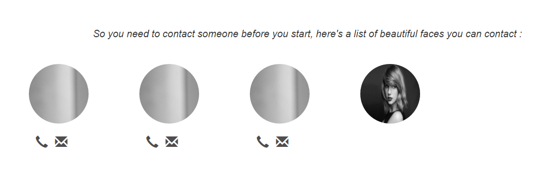
嗨弗朗西斯科,我檢查了我的bootstrap文件,他們都很好,我使用3.3.5以及 –
那麼使用我的評論中的類,你不需要更多的CSS與引導樣式你將有你的圖像在響應式的圈子和喜歡你想要的。 –
我無法使用IMG標籤,因爲我使用的CSS 3動畫需要我使用div標籤 –