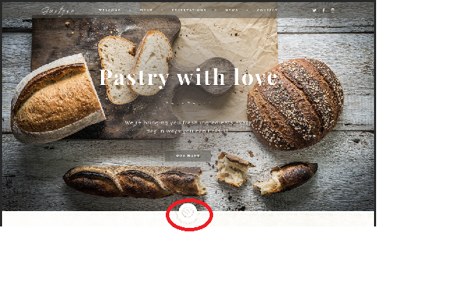
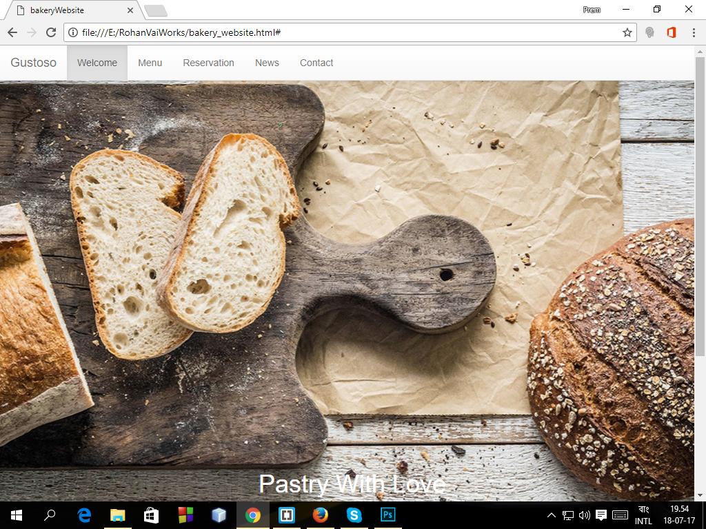
2017-07-18 108 views
0

強大的文本*desired result, how can I add the design marked with the red circle...[![this is my current result] 2 *如何使固定導航欄與背景圖像?

*


**我都試過這些HTML和CSS代碼,以獲得所需的結果。我還應該添加或減去我的HTML或CSS?請提供 建議。

<div class="firstPart"> 
      <nav class="navbar navbar-default navbar-fixed-top"> 
       <div class="container-fluid"> 
        <!-- Brand and toggle get grouped for better mobile display --> 
       <div class="navbar-header"> 
        <button type="button" class="navbar-toggle collapsed" data-toggle="collapse" data-target="#bs-example-navbar-collapse-1" aria-expanded="false"> 
         <span class="sr-only">Toggle navigation</span> 
         <span class="icon-bar"></span> 
         <span class="icon-bar"></span> 
         <span class="icon-bar"></span> 
        </button> 
         <a class="navbar-brand" href="#">Gustoso</a> 
       </div> 

      <!-- Collect the nav links, forms, and other content for toggling --> 
      <div class="collapse navbar-collapse" id="bs-example-navbar-collapse-1"> 
       <ul class="nav navbar-nav"> 
        <li class="active"><a href="#">Welcome<span class="sr-only">(current)</span></a></li> 
        <li><a href="#">Menu</a></li> 
        <li><a href="#">Reservation</a></li> 
        <li><a href="#">News</a></li> 
        <li><a href="#">Contact</a></li> 
       </ul> 
      <ul class="nav navbar-nav navbar-right"> 
       <li><i class="fa fa-twitter"></i></li> 
       <li><i class="fa fa-twitter"></i></li> 
       <li><i class="fa fa-twitter"></i></li> 
      </ul> 
       </div><!-- /.navbar-collapse --> 
      </div><!-- /.container-fluid --> 
     </nav> 

    </div> <!--.firstPart--> 
    <section class="headerArea"> 
     <h1>Pastry With Love</h1> 

    </section><!--.headerArea--> 

這裏是CSS:

body { 
    margin: 0; 
    padding: 0; 
    font-size: 14px; 
    color: black; 
    background-color: #f3f1f2; 
} 
.firstPart { 
    background: url('bannerFirst.jpg'); 
    background-repeat: no-repeat; 
    background-size: cover; 
    background-position: center; 
    min-height: 100%; 
    padding-top: 0px; 
    padding-bottom: 957px; 
} 
.navbar-default { 
    background: none; 
} 
.navbar-default .navbar-collapse { 
    border-color: #e7e7e7; 
    background-color: transparent; 
} 
.backgroundImage { 
    width: device-width; 
} 
.nav navbar-nav { 
    font-size: 14px; 
    font-family: "Alegreya"; 
    color: rgb(255, 255, 255); 
    text-transform: uppercase; 
    line-height: 1.714; 
    position: absolute; 
    left: 413.844px; 
    top: 23.002px; 
    z-index: 275; 
    display: inline-block; 
    padding-right: 44px; 
    padding-top: 4px; 
} 
.headerArea { 
    color: white; 
    font-size: 30px; 
    margin-top: -360px; 
    margin-left: 375px; 
} 
+0

這裏是CSS代碼(對不起,這...我在發佈時遇到問題) body { \t margin:0; \t padding:0; \t font-size:14px; \t顏色:黑色; \t background-color:#f3f1f2; \t } .firstPart { background:url('bannerFirst.jpg'); background-repeat:no-repeat; background-size:cover; background-position:center;最小高度:100%; padding-top:0px; padding-bottom:957px; } .navbar-default { background:none; } .navbar-default .navbar-collapse {border = color:#e7e7e7; background-color:transparent; } – Prem

+0

CSS的其餘部分 .backgroundImage { width:device-width; } .nav navbar-nav。歡迎_____〜_____菜單_____〜_____ reservations__ { font-size:14px; font-family:「Alegreya」; color:rgb(255,255,255); text-transform:大寫; line-height:1.714; position:absolute; left:413.844px; top:23.002px; z-index:275; display:inline-block; padding-right:44px; padding-top:4px; } 。headerArea { 顏色:白色; font-size:30px; margin-top:-360px; margin-left:375px; } – Prem

+0

請編輯您的問題,而不是在評論中添加CSS。編輯按鈕位於問題的底部,位於標籤下方。 –

回答

0
position:fixed; 
top:0; 
left:0; 

看看this

如果這不是一個,可以請你給烏拉圭回合中的jsfiddle代碼:) 感謝

0

在這裏你可以用解決方案https://jsfiddle.net/ctoL942n/

body { 
 
    margin: 0; 
 
    padding: 0; 
 
    font-size: 14px; 
 
    color: black; 
 
    background-color: #f3f1f2; 
 
} 


.firstPart{ 
 
    background: url('http://www.butcherblock.com/wp-content/uploads/2012/06/Pleasanton0031.jpg'); 
 
    background-repeat: no-repeat; 
 
    background-size: cover; 
 
    min-height:100%; 
 
    padding-top: 0px; 
 
    padding-bottom: 957px; 
 
    background-position:0px 50px; 
 
} 
 
.navbar-default { background: none; } .navbar-default .navbar-collapse{ border-color: #e7e7e7; background-color: transparent; } 
 
.backgroundImage{ width: device-width; } .nav navbar-nav. Welcome_____~_____Menu_____~_____reservations__ { font-size: 14px; font-family: "Alegreya"; color: rgb(255, 255, 255); text-transform: uppercase; line-height: 1.714; position: absolute; left: 413.844px; top: 23.002px; z-index: 275; display: inline-block; padding-right: 44px; padding-top: 4px; } .headerArea{ color: white; font-size: 30px; margin-top: -360px; margin-left: 375px; }
<link href="https://maxcdn.bootstrapcdn.com/bootstrap/3.3.7/css/bootstrap.min.css" rel="stylesheet"/> 
 
<div class="firstPart"> 
 
      <nav class="navbar navbar-default navbar-fixed-top"> 
 
       <div class="container-fluid"> 
 
        <!-- Brand and toggle get grouped for better mobile display --> 
 
       <div class="navbar-header"> 
 
        <button type="button" class="navbar-toggle collapsed" data-toggle="collapse" data-target="#bs-example-navbar-collapse-1" aria-expanded="false"> 
 
         <span class="sr-only">Toggle navigation</span> 
 
         <span class="icon-bar"></span> 
 
         <span class="icon-bar"></span> 
 
         <span class="icon-bar"></span> 
 
        </button> 
 
         <a class="navbar-brand" href="#">Gustoso</a> 
 
       </div> 


      <!-- Collect the nav links, forms, and other content for toggling --> 
 
      <div class="collapse navbar-collapse" id="bs-example-navbar-collapse-1"> 
 
       <ul class="nav navbar-nav"> 
 
        <li class="active"><a href="#">Welcome<span class="sr-only">(current)</span></a></li> 
 
        <li><a href="#">Menu</a></li> 
 
        <li><a href="#">Reservation</a></li> 
 
        <li><a href="#">News</a></li> 
 
        <li><a href="#">Contact</a></li> 
 
       </ul> 
 
      <ul class="nav navbar-nav navbar-right"> 
 
       <li><i class="fa fa-twitter"></i></li> 
 
       <li><i class="fa fa-twitter"></i></li> 
 
       <li><i class="fa fa-twitter"></i></li> 
 
      </ul> 
 
       </div><!-- /.navbar-collapse --> 
 
      </div><!-- /.container-fluid --> 
 
     </nav> 


    </div> <!--.firstPart--> 
 
    <section class="headerArea"> 
 
     <h1>Pastry With Love</h1> 


    </section><!--.headerArea-->

使用背景位置:0像素50像素;從特定位置開始背景圖像。