0
我試圖創建一個消息氣泡,看起來與此類似:CSS - 創建高級形狀。 (倒三角形?)
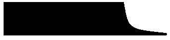
然而,所有我可以管理是這樣的:
使用這CSS:
#messaging #test:after {
    content: "";
    display: block; /* reduce the damage in FF3.0 */
    position: relative;
    bottom: 0px;
    left: 120px;
    width: 0;
    transform: rotate(180deg);
    border-width: 32px 30px 0;
    border-style: solid;
    border-radius-top: 10;
    border-color: black transparent;
}
我試着使用border-radius,但它沒有yeild Ë預期的效果
此頁面沒有您要查找的形狀,但它可以幫助您瞭解一些可能有所幫助的技巧:https://css-tricks.com/examples/ShapesOfCSS/ – Flynn1179
@ Flynn1179 - 月亮技巧非常酷,感謝鏈接。 – Hobbyist
我不知道這對你有什麼幫助,但我很高興它:) – Flynn1179