-1
我想佈局我的div,裏面有三個div。該應用程序使用Bootstrap。他們似乎沒有正確地佈置中心的所有文字或按鈕。我在第二個和第三個盒子之間使用分隔符。該應用程序還使用另一個類content-header,該類來自應用程序中其他位置使用的proui庫,並在此處借用以保持整個應用程序具有相同的外觀和感覺。大膽地設置div的內容
這是簡化的HTML
<!--FIXED PANEL-->
<div class="content-header fd">


    <!-- first box-->
    <div class="col-md-6 fdc" style="display:block; visibility:visible">
     first box
    </div>

    <!--second box-->
    <div class="col-md-2 fdc" >
     second box
    <span class="pipe_separator">|</span>
    </div>

    <!--third box-->
    <div class="col-md-4 fdc text-left">
     third box
    </div>

</div>
這裏是CSS
.fd{
     position: fixed;
     top: 70px;
     width:100%;
     background-color: #141313ad;
     z-index: 1
    }

    .fdc{
     display: inline-block;
     *display: inline; zoom: 1;
     vertical-align:middle;
     background-color: #141313e5;
     height: 75px;
     border-color: black;

    }

    .pipe_separator{
     font-size: 40px;
    }

}
</style>
這裏是什麼樣子 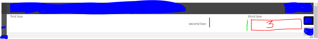
正如你所看到的內容盒子不對齊。我希望第三個div和它的內容是我已經用內部數字3繪製出來的地方。分隔符就在它的左邊,我畫了綠線,第二個div在分隔符的左邊,第一個div在第二個div的左邊。保存這三個圖層的主div用作頁眉下面的固定面板。我如何讓它們排列在一起並按照我所描述的方式坐下。
您的投票沒有評論讓我不知道這個問題出了什麼問題! – user20358