2016-02-12 86 views
0

您將如何構建響應圖像網格,圖像高度和寬度不盡相同。建議的解決方案將需要純粹在CSS和工作在IE9及以上。響應式CSS圖/圖像網格

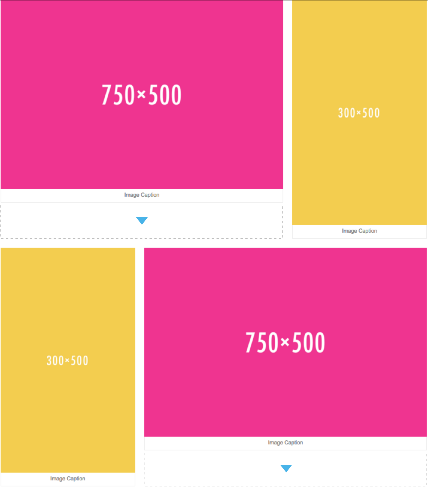
理想情況下,圖像應該尊重分配給它們的寬度,但它們的高度應該是相同的值,直到到達移動視口。對於移動視口,圖像將作爲塊元素堆疊。

對於這個例子,我使用了一個包含圖像和與圖像相關的標題的圖形元素。

例HTML結構:

<div> 
    <figure class="landscape"> 
    <img 
     src="http://placehold.it/750x500/e8117f/ffffff" 
     alt="" 
     > 
    <figcaption> 
     Image Caption 
    </figcaption> 
    </figure> 
    <figure class="portrait"> 
    <img 
     src="http://placehold.it/300x500/efc63e/ffffff" 
     alt="" 
     > 
    <figcaption> 
     Image Caption 
    </figcaption> 
    </figure> 
</div> 

當前HTML和CSS: JSFiddle

在參照圖像的下方貼:與尺寸750×500的圖像需要以填補所概述的間隙虛線描邊與300x500尺寸的圖像高度相同。

Image grid reference.

回答

0

一個簡單的方法來做到這一點是Flexbox的。缺點是ie9不支持flexbox。

/* Body */ 


body { 
 
    background-color: #fff; 
 
    margin: 0; 
 
} 


/* Container */ 


div { 
 
    display: block; 
 
    font-size: 0; 
 
    margin: 0 auto; 
 
    max-width: 1050px; 
 
    text-align: center; 
 
    display: flex; 
 
    flex-flow: row wrap; 
 
    align-items: stretch; 
 
} 


/* Figure */ 


figure { 
 
    display: block; 
 
    margin: 0 auto 20px auto; 
 
    vertical-align: top; 
 
} 


.landscape { 
 
    max-width: 750px; 
 
} 


.portrait { 
 
    max-width: 300px; 
 
} 


img { 
 
    width: 100%; 
 
    height: 95%; 
 
} 


figcaption { 
 
    background-color: #fff; 
 
    border: 1px solid #eee; 
 
    border-top: none; 
 
    border-radius: 0 0 2px 2px; 
 
    color: #888; 
 
    font: 12px arial, sans-serif; 
 
    margin-top: -4px; 
 
    padding: 10px 5px; 
 
    text-align: center; 
 
} 


@media screen and (min-width: 768px) { 
 
    figure { 
 
    display: inline-block; 
 
    margin-right: 20px; 
 
    } 
 
    figure:nth-child(even) { 
 
    margin-right: 0; 
 
    } 
 
    .landscape { 
 
    width: 60%; 
 
    } 
 
    .portrait { 
 
    width: 40%; 
 
    } 
 
} 


@media screen and (min-width: 1024px) { 
 
    /* Placeholder */ 
 
}
<div> 
 
    <figure class="landscape"> 
 
    <img src="http://placehold.it/750x500/e8117f/ffffff" alt=""> 
 
    <figcaption> 
 
     Image Caption 
 
    </figcaption> 
 
    </figure> 
 
    <figure class="portrait"> 
 
    <img src="http://placehold.it/300x500/efc63e/ffffff" alt=""> 
 
    <figcaption> 
 
     Image Caption 
 
    </figcaption> 
 
    </figure> 
 
    <figure class="portrait"> 
 
    <img src="http://placehold.it/300x500/efc63e/ffffff" alt=""> 
 
    <figcaption> 
 
     Image Caption 
 
    </figcaption> 
 
    </figure> 
 
    <figure class="landscape"> 
 
    <img src="http://placehold.it/750x500/e8117f/ffffff" alt=""> 
 
    <figcaption> 
 
     Image Caption 
 
    </figcaption> 
 
    </figure> 
 
</div>