-1
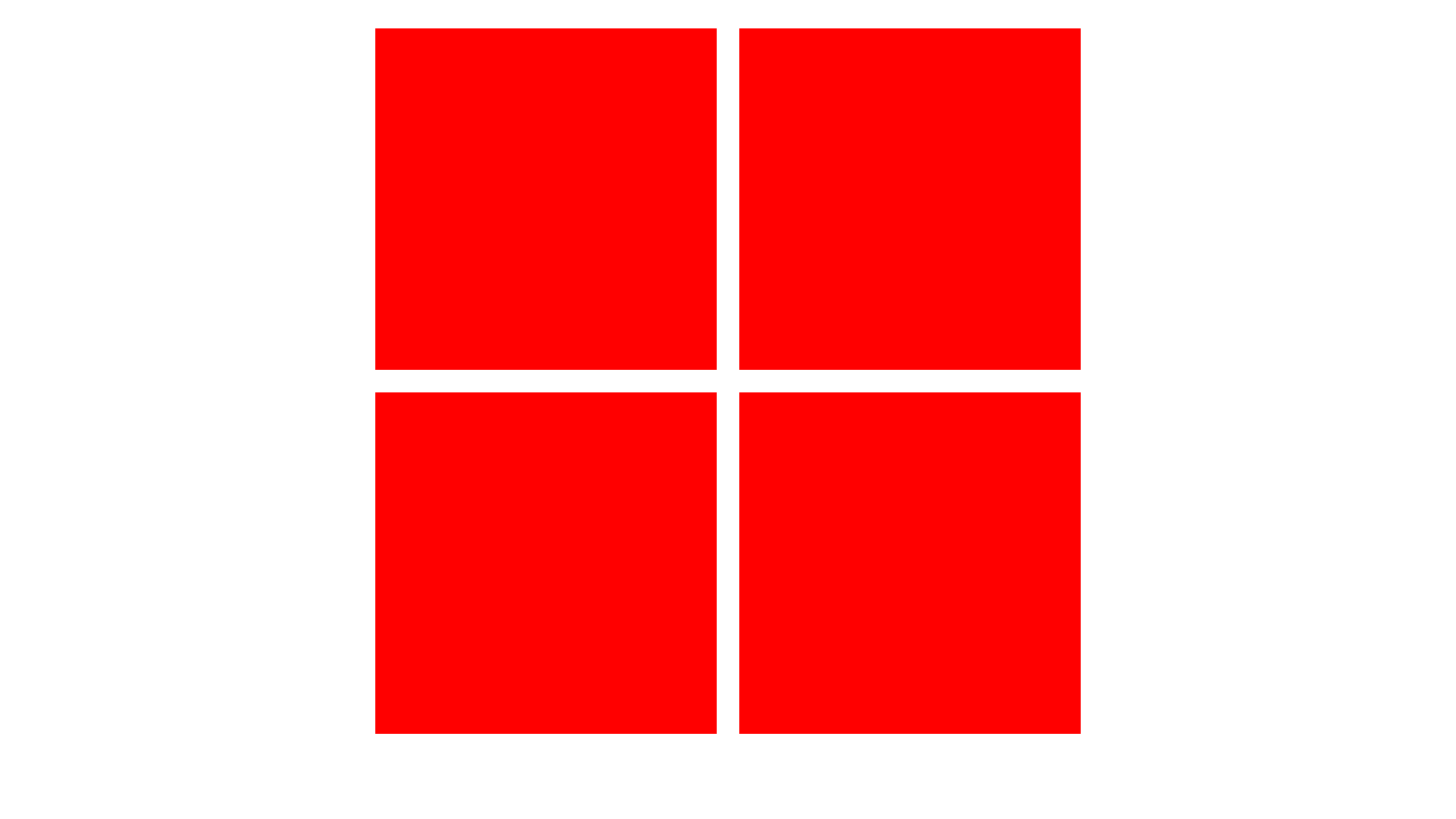
我試圖在2x2(水平x垂直)網格中製作圖像網格。當屏幕尺寸縮小時,我希望這些圖像以1x4垂直格式顯示,以便它們保留大部分尺寸。我發現了幾個來自不同網站的相關文章,但它們都有內容填滿整個頁面。這不是我想要做的事情。下圖顯示了2x2網格的外觀。在網站的大小版本上,圖像填滿整個屏幕是完全可以的。我會如何去做這件事?2x2圖像響應式圖像網格
我現在已經包含了一些關於如何粗略看看最終產品的截圖,但圖像取代了紅色正方形。
e.g. desktop resolution
e.g. smartphone resolution
.imageLineTop {

\t display: inline-block;

\t width: 100%;

\t height: 725px;

\t top: 60%;

\t left: 50%;

\t transform: translate(50%, 50%);

}


.imageLineBottom {

\t display: inline-block;

\t margin-top: 45px;

\t width: 100%;

\t height: 725px;

\t top: 60%;

\t left: 50%;

\t transform: translate(50%, 50%);

}


#img0 {

\t height: 700px;

}


#img1 {

\t height: 700px;

}


#img2 {

\t height: 700px;

}


#img3 {

\t height: 700px;

}


#fadeBox0 {

\t width: 478px;

\t height: 700px;

\t background-color: black;

\t opacity: 0.5;

\t left: 24%;

\t position: absolute;

\t display: none;

}


#fadeBox1 {

\t width: 478px;

\t height: 700px;

\t background-color: black;

\t opacity: 0.5;

\t right: 24%;

\t position: absolute;

\t display: none;

}


#fadeBox2 {

\t width: 478px;

\t height: 700px;

\t background-color: black;

\t opacity: 0.5;

\t left: 24%;

\t position: absolute;

\t display: none;

}


#fadeBox3 {

\t width: 478px;

\t height: 700px;

\t background-color: black;

\t opacity: 0.5;

\t right: 24%;

\t position: absolute;

\t display: none;

}
\t <!--Top image line-->
\t \t <section class="imageLineTop">
\t \t \t <img class="discoverImage" id="img0" src="assets/imgs/1.jpg">
\t \t \t <img class="discoverImage" id="img1" src="assets/imgs/2.jpg">
\t \t \t <section id="fadeBox0">
\t \t \t \t <h3 class="imageInlineTitle">Purity.</h3>
\t \t \t </section>
\t \t \t <section id="fadeBox1">
\t \t \t \t <h3 class="imageInlineTitle">Style.</h3>
\t \t \t </section>
\t \t </section>
\t \t <!--Bottom image line-->
\t \t <section class="imageLineBottom">
\t \t \t <img class="discoverImage" id="img2" src="assets/imgs/3.jpg">
\t \t \t <img class="discoverImage" id="img3" src="assets/imgs/4.jpg">
\t \t \t <section id="fadeBox2">
\t \t \t \t <h3 class="imageInlineTitle">Integrity.</h3>
\t \t \t </section>
\t \t \t <section id="fadeBox3">
\t \t \t \t <h3 class="imageInlineTitle">Courage.</h3>
\t \t \t </section>
\t \t </section>
所以只需將父DIV這2個圖像與一些最大寬度和中間父DIV。 –
你可以發佈你的代碼嗎? – Tommy
當然,現在上傳它。 – Josh