2016-07-26 117 views
1

我創建了一個響應式網頁,並使用樣式爲ul的選擇器來提供多窗格視圖。將元素與父元素和中心的底部對齊

<ul class="threepane"> 
    <li> 
     <h3>Section 1</h3> 
     <p>Foo <br /> bar <br /> baz </p> 
     <a href="x.html" class="button">More</a> 
    </li> 
    <li> 
     <h3>Section 2</h3> 
     <p>Foo <br/> bar </p> 
     <a href="y.html" class="button">More</a> 
    </li> 
    <li> 
     <h3>Section 3</h3> 
     <p>Foo</p> 
     <a href="z.html" class="button">More</a> 
    </li> 
</ul> 

我現在不會發布整個樣式,以免混亂帖子。讓我知道我是否應該這樣做。這看起來像現在右:

current page

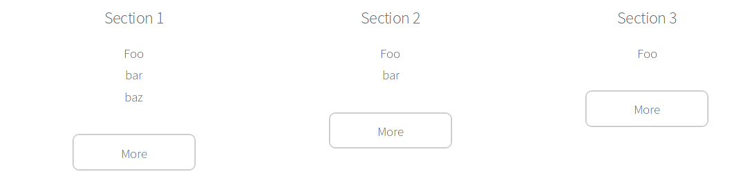
唯一的問題是按鈕的定位 - 我想他們是在一個高度。所以我說這個選擇我的風格

#about { 
    position: relative; 
} 

#about .button { 
     position: absolute; 
     bottom: 0; 
} 

不幸的是,現在的按鈕不居中(按鈕的左邊框是在面板的中心)。當然,如果窗格顯示一個在另一個之上,所有按鈕都顯示在同一個地方。另一方面,如果我將#about選擇器更改爲#about ul#about li,則ul塊會縮小並且按鈕對齊得太高。

我想要的是:所有的按鈕應該在一行中最靠近底部的按鈕。在這種情況下:將第二個和第三個按鈕的高度與第一個按鈕對齊(但我不想硬編碼第一個窗格最長)

我該如何實現它?

+1

您使用Flexbox的 –

+0

我不知道這是否是一個好主意,乾脆放棄IE瀏覽器的支持。 IE11不支持flexbox。 – marmistrz

+0

然後應用最小高度或修復高度 –

回答

1

Flexbox,就可以做到這一點沒有定位什麼

.threepane { 
 
    display: flex; 
 
    margin: 0; 
 
} 
 
li { 
 
    flex: 1; 
 
    display: flex; 
 
    flex-direction: column; 
 
    border: 1px solid grey; 
 
    padding: 1em; 
 
} 
 
li a { 
 
    margin-top: auto; 
 
    align-self: center; 
 
}
<ul class="threepane"> 
 
    <li> 
 
    <h3>Section 1</h3> 
 
    <p>Lorem ipsum dolor sit amet, consectetur adipisicing elit. Molestiae dolor laboriosam modi ab inventore voluptatum labore quae reiciendis odit totam cum alias quidem minima obcaecati atque ip.</p> 
 
    <a href="x.html" class="button">More</a> 
 
    </li> 
 
    <li> 
 
    <h3>Section 2</h3> 
 
    <p>Foo 
 
     <br/>bar</p> 
 
    <a href="y.html" class="button">More</a> 
 
    </li> 
 
    <li> 
 
    <h3>Section 3</h3> 
 
    <p>Foo</p> 
 
    <a href="z.html" class="button">More</a> 
 
    </li> 
 
</ul>

1

您可以像下面一樣使用flexbox。它支持IE10以上。

* { 
 
\t -webkit-box-sizing: border-box; 
 
\t -moz-box-sizing: border-box; 
 
\t 
 
\t box-sizing: border-box; 
 
} 
 
.threepane { 
 
    display: -webkit-flex; 
 
    display: -ms-flexbox; 
 
    display: flex; 
 
} 
 
.threepane li { 
 
    -webkit-flex: 1; 
 
     -ms-flex: 1; 
 
      flex: 1; 
 
      background: yellow; 
 
      position: relative; 


} 
 
.threepane li p { 
 
    margin-bottom: 30px; 
 
} 
 
.threepane li a { 
 
    position: absolute; 
 
    bottom: 5px; 
 
}
<ul class="threepane"> 
 
    <li> 
 
     <h3>Section 1</h3> 
 
     <p>Foo <br /> bar <br /> baz </p> 
 
     <a href="x.html" class="button">More</a> 
 
    </li> 
 
    <li> 
 
     <h3>Section 2</h3> 
 
     <p>Foo <br/> bar </p> 
 
     <a href="y.html" class="button">More</a> 
 
    </li> 
 
    <li> 
 
     <h3>Section 3</h3> 
 
     <p>Foo</p> 
 
     <a href="z.html" class="button">More</a> 
 
    </li> 
 
</ul>

1

您可以添加position: relativeul代替li並達到預期的結果

HTML

<ul class="threepane"> 
    <li> 
     <h3>Section 1</h3> 
     <p>Foo <br /> bar <br /> baz </p> 
     <a href="x.html" class="button">More</a> 
    </li> 
    <li> 
     <h3>Section 2</h3> 
     <p>Foo <br/> bar </p> 
     <a href="y.html" class="button">More</a> 
    </li> 
    <li> 
     <h3>Section 3</h3> 
     <p>Foo</p> 
     <a href="z.html" class="button">More</a> 
    </li> 
</ul> 

CSS

.button { 
     position: absolute; 
     bottom: 0; 
} 

li { 
    width: 32%; 
    float: left; 
    height: 100%; 
} 

.threepane { 
    overflow: hidden; 
    position: relative; 
} 

例子:http://jsbin.com/xatihoneze/edit?html,css,output

1

試試這個:

<style> 
li{ 
position:relative; 
text-align:center; 
display: inline-block; 
height: 150px; 
overflow-y: auto; 
} 

li p{ 
display:block; 
width:100px; 
height:100px; 
overflow: auto; 
} 

li .button{ 
position: absolute; 
bottom:0; 
margin: 0 auto; 
}